Making Shiny apps mobile friendly
Use Bootstrap to get your apps to do exactly what you want
I recently saw a Twitter exchange where Jesse Mostipak was asking people what they struggled to learn to do with Shiny and @deepvaluebettor mentioned getting Shiny apps to work on mobile. I was kind of surprised by this because I have been making Shiny mobile apps for some time and I never noticed that there wasn’t a good guide on how to make one. So, to contribute to the good of the world here is one such blog post. The great news is that making Shiny apps work on mobile is very easy with the Bootstrap framework.
Before we get to how to make a mobile site, first a little background. While Shiny feels like you’re just writing R code, what Shiny is doing on the backend is converting your code to HTML (content) and CSS (styling) and showing that to the users. Specifically the ui part of a Shiny app is HTML specified as R code. For instance the Shiny R function div("...") in ui represents <div>...</div>. The CSS is entirely abstracted away by Shiny on the backend.
So to make Shiny work on mobile we have to reason a little bit about HTML and CSS. Thankfully you only have to think about these a little bit, and you’ll still be writing R code.
Website developers generally dislike having to write all of their CSS from scratch, so they use frameworks of premade CSS classes as starting points. Shiny on the backend is based on Bootstrap, the most popular CSS framework in the world. A core part of Bootstrap is the grid system, which customizes how a website is laid out on screens of different sizes. So by using the Bootstrap grid system we can make a Shiny site mobile friendly.
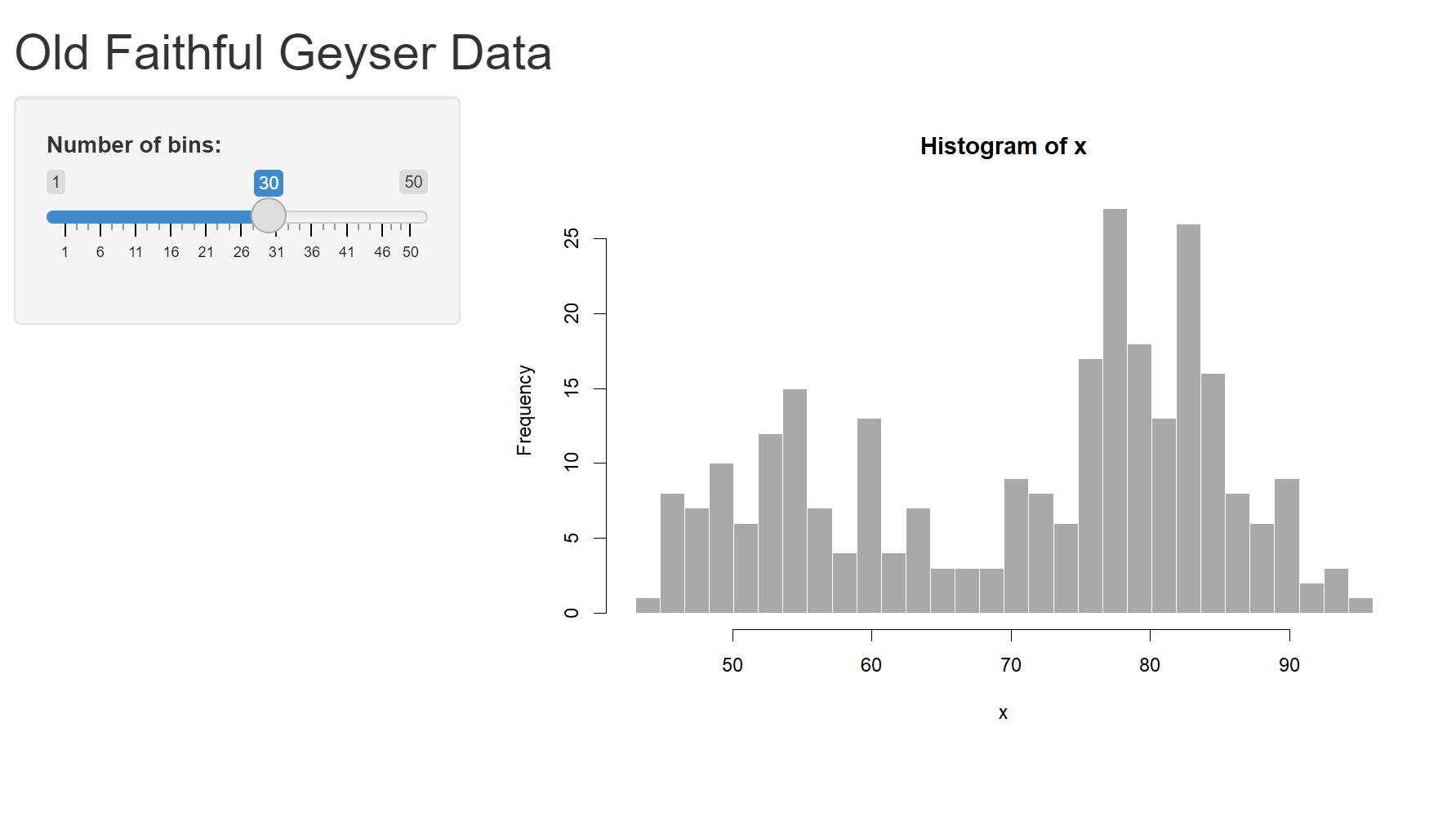
In this guide I will adjust how the default template Shiny geyser website works on mobile by using Bootstrap classes. To get started and follow along, create a default Shiny app and open the app.R file (for convenience I deleted the comments):
library(shiny)

ui <- fluidPage(
    titlePanel("Old Faithful Geyser Data"),
    sidebarLayout(
        sidebarPanel(
            sliderInput("bins",
                        "Number of bins:",
                        min = 1,
                        max = 50,
                        value = 30)
        ),
        mainPanel(
           plotOutput("distPlot")
        )
    )
)

server <- function(input, output) {
    output$distPlot <- renderPlot({
        x    <- faithful[, 2]
        bins <- seq(min(x), max(x), length.out = input$bins + 1)
        hist(x, breaks = bins, col = 'darkgray', border = 'white')
    })
}

shinyApp(ui = ui, server = server)
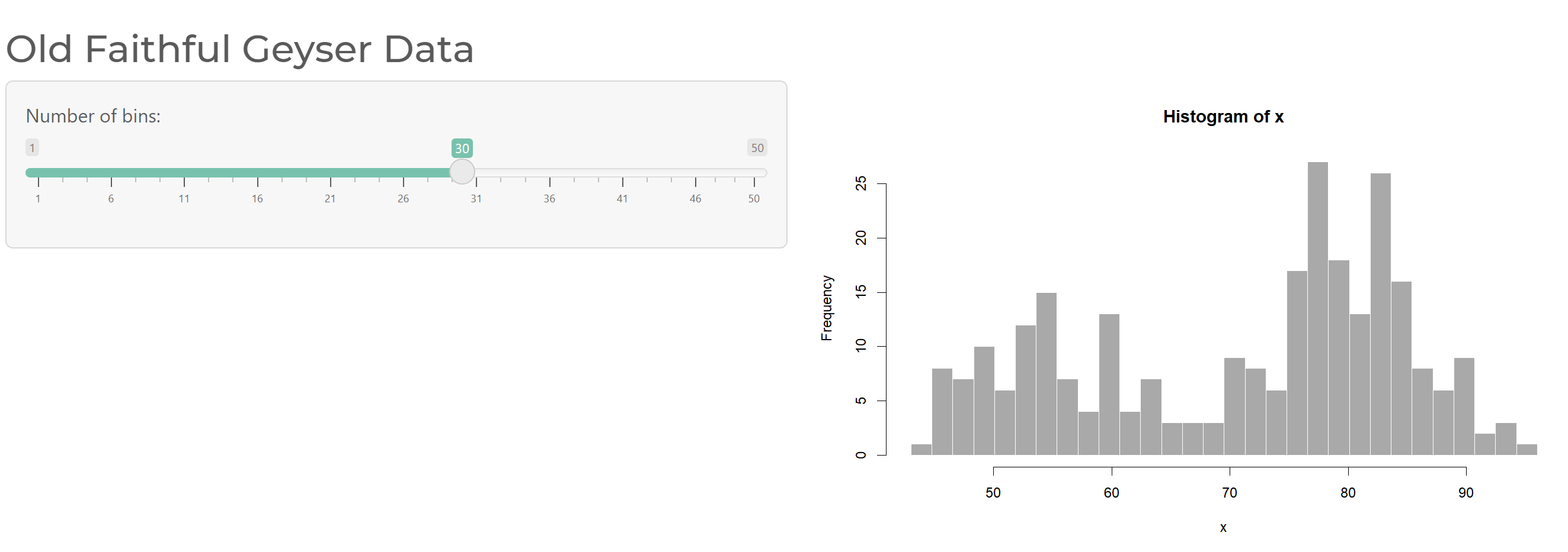
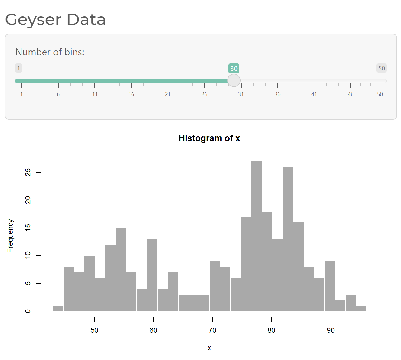
| Desktop | Mobile |
|---|---|
 |
 |
(The server and shinyApp calls won’t change for the rest of this blog post so I’ll leave them out henceforth)
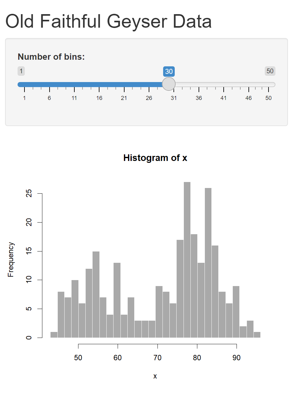
Before we start making it mobile friendly, there is a bit of housekeeping to do. While Shiny uses the Bootstrap framework, as of 2021 it uses v3.4.1, which became obsolete in 2015 (!!). Thankfully RStudio made it easy to convert Shiny apps to using later versions of Bootstrap. The most recent version is v5, and with the {bslib} we can use that one. Make sure to install from GitHub and not CRAN (the CRAN version only supports v4):
remotes::install_github("rstudio/bslib")
The package {bslib} is fantastic no only for updating the version of Bootstrap, but it also can change which bootstrap theme we’re using, or even individual styling variables. To use {bslib}, make a theme and pass it to the ui Page function:
ui <- fluidPage(
    theme = bs_theme(version = 5, bootswatch = "minty"),
    titlePanel("Old Faithful Geyser Data"),
    sidebarLayout(
        sidebarPanel(
            sliderInput("bins",
                        "Number of bins:",
                        min = 1,
                        max = 50,
                        value = 30)
        ),
        mainPanel(plotOutput("distPlot"))
    )
)
Already when you run the app you’ll see the colors are different. As a user you won’t notice this, but on the backend it’s using Bootstrap 5 as well.
If you’ll notice the app already does some layout stuff. It has a sidebar on the left with the controls, and if you resize you window to be skinny you’ll see that the controls shift to above the plot. That’s because fluidPage, sidebarLayout, and other functions in the template app are convenience functions for the Bootstrap classes.
The Bootstrap grid system determines how to layout content in a place on a website. You should skim that article, but the basic idea is for a “row” of space on a website you have 12 “columns” to split your content into. If your columns add up to more than 12 they wrap below.
And you can specify the minimum size of a screen for these rules, from col-xs meaning they apply to the smallest size screens and up to col-xxl meaning they only apply to the widest of screens. The number after is how many columns wide it should be, so say col-md-6 represents half the row on screen sizes medium and up (otherwise the full width). Not specifying a value is equivalent to col-xs-12, meaning have it be the entire width of the row for all size screens.
Say, If you wanted 1/3rd of a website to be the controls for a plot and the other 2/3rds to be the plot itself, except on mobile have the controls and plot each be as wide as a screen. In that case you’d do something in HTML like:
<div class="row">
    <div class="col-sm-4">
        "controls..."
    </div>
    <div class="col-sm-8">
        "plot..."
    </div>
</div>
Here the controls are 4 columns wide unless the screen size is less than sm (in which case they default to all 12 columns), and the plot is similarly 8 columns wide (or all 12 on very small screens).
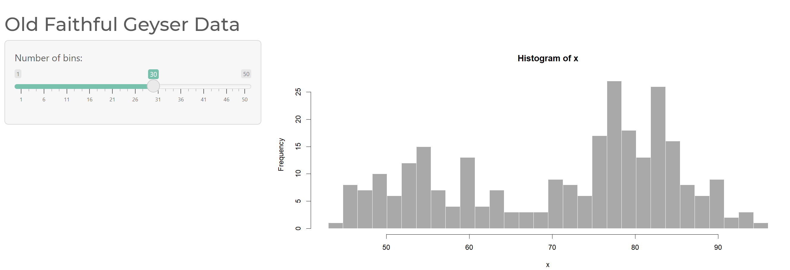
In fact, what I just described is exactly what the helper Shiny functions are doing behind the scenes in that template. Here is the same code as before but rewritten to use the actual HTML Shiny commands instead of the helpers:
ui <- bootstrapPage(
    theme  = bs_theme(version = 5, bootswatch = "minty"),
    div(class="container-fluid",
        h2("Old Faithful Geyser Data"),
        div(class="row",
            div(class="col-sm-4",
                div(class="well",
                    sliderInput("bins", "Number of bins:", min = 1, max = 50, value = 30),
                )
            ),
            div(class="col-sm-8",
                plotOutput("distPlot")
            )
        )
    )
)
Cool, okay so all I’ve actually done so far is rewrite the template in a different way (wow cool blog post). But now that we’re using Bootstrap we can start doing all sorts of fun things, like:
Change the widths of these columns more specifically
Let’s say we want to the controls to move to on top of the plot on both mobile and tablets instead of just mobile. And maybe let’s have the controls take up half the screen instead of a third on PCs. Well in this case we can up the minimum screen width to side by size from sm to lg, and switch the columns to both be 6
ui <- bootstrapPage(
    theme  = bs_theme(version = 5, bootswatch = "minty"),
    div(class="container-fluid",
        h2("Old Faithful Geyser Data"),
        div(class="row",
            div(class="col-lg-6",
                div(class="well",
                    sliderInput("bins", "Number of bins:", min = 1, max = 50, value = 30),
                )
            ),
            div(class="col-lg-6",
                plotOutput("distPlot")
            )
        )
    )
)
Change the content if you’re on mobile
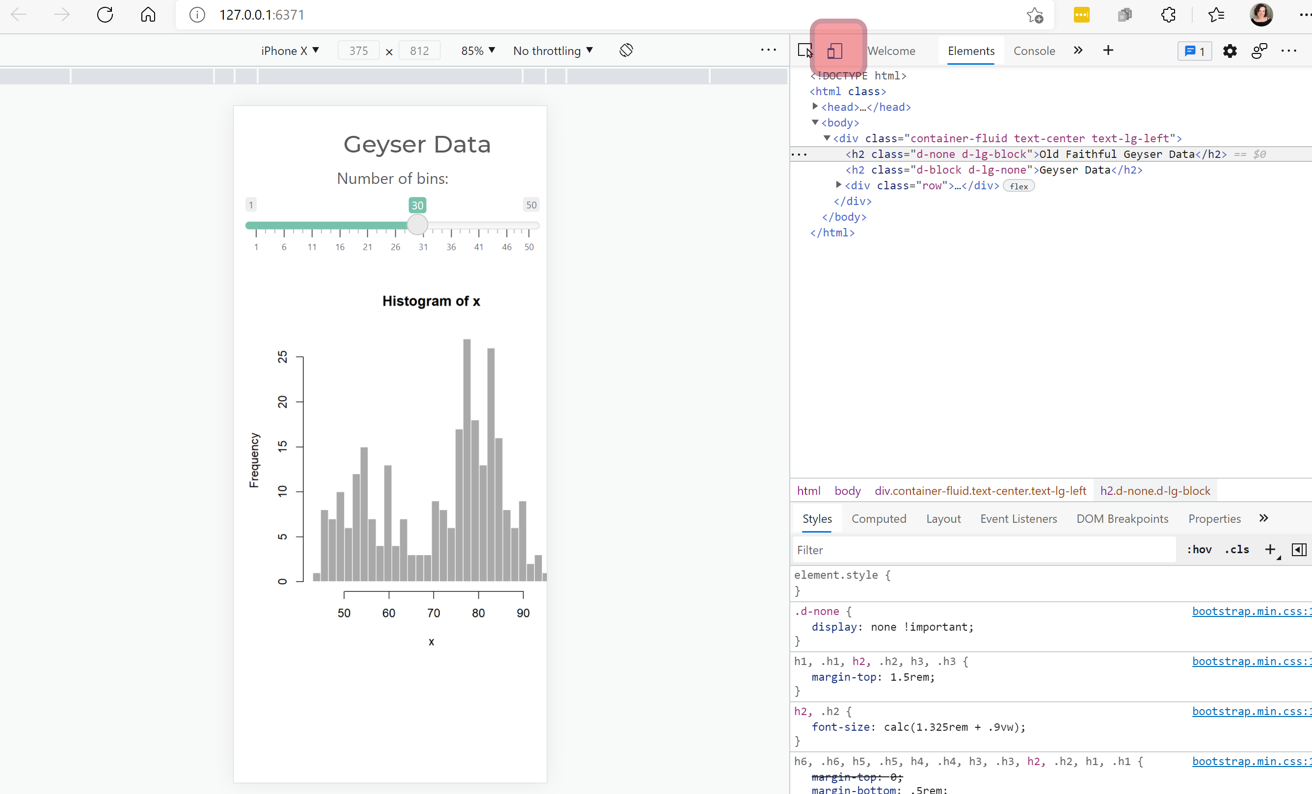
If you wanted to have the title change based on if you’re on mobile, we can use Bootstrap to conditionally show different titles based on screen width using their classes. Here I will have two titles, one for if you’re screen width lg or above (otherwise hidden), one if you’re less than screen width lg (otherwise hidden).
ui <- bootstrapPage(
    theme  = bs_theme(version = 5, bootswatch = "minty"),
    div(class="container-fluid",
        h2("Old Faithful Geyser Data", class="d-none d-lg-block"),
        h2("Geyser Data", class="d-block d-lg-none"),
        div(class="row",
            div(class="col-lg-6",
                div(class="well",
                    sliderInput("bins", "Number of bins:", min = 1, max = 50, value = 30),
                )
            ),
            div(class="col-lg-6",
                plotOutput("distPlot")
            )
        )
    )
)
Change the styling on mobile
Maybe you want to have the title be centered on mobile and tablets. We can use Bootstraps text-center (center justify the text) and text-start (left justify the text) with size modifiers to get this. I’m going to put this in a separate div around the titles to make it a little easier to read:
ui <- bootstrapPage(
    theme  = bs_theme(version = 5, bootswatch = "minty"),
    div(class="container-fluid",
        div(class="text-center text-lg-start",
            h2("Old Faithful Geyser Data", class="d-none d-lg-block"),
            h2("Geyser Data", class="d-block d-lg-none")
        ),
        div(class="row",
            div(class="col-lg-6",
                div(class="well",
                    sliderInput("bins", "Number of bins:", min = 1, max = 50, value = 30),
                )
            ),
            div(class="col-lg-6",
                plotOutput("distPlot")
            )
        )
    )
)

Other Bootstrap fun
You don’t just have to use Bootstrap only for custom mobile stuff. Here are a few random bootstrap classes I am constantly using:
py-3add vertical (y) padding above and below something.text-primarymake text a primary colorbtn btn-lg btn-secondaryadd these to an action button to change the color of it.
One last tip, by far the best way to use and debug Shiny apps is to open them in your browser and inspect elements. So after you run a Shiny app you should see an Open in browser button, which will open the page in your default browser. Right-click on any aspect of the app and select inspect–you’ll now see the HTML powering your site. You can even edit this in real time and see how the site changes! You can also press a button to see the page on a pretend mobile browser! It’s really good!!
So with that brief introduction I hope you have a better understanding of how to make a Shiny app for mobile browsers. There are tons and tons of cool Bootstrap classes you can use for better Shiny design, and the good news is that it’s such a broad framework you can find lots of reading material about it.
If you want to see a Shiny app with lots of bootstrap in action check out my {ggirl} R package, which uses Shiny as an ecommerce platform which processes orders and takes payments.