Hugo for fussy people
How to make a Hugo theme that looks exactly like you want it to
For the longest time I’ve wanted to love Hugo, the popular framework for generating static websites. Since 2018 I’ve had a blog that was hosted on Medium, but that’s becoming increasingly annoying as Medium is putting people’s blog posts behind paywalls. I’ve also have had a personal website that I hand coded in HTML, which isn’t exactly a great use of time. Hugo seemed like a nice way to both create an elegant looking personal website and also be able to write my blog posts in markdown then quickly host them. I know enough HTML and CSS to get my hands dirty, but ideally I shouldn’t have to.
The only problem here is that I’m extremely fussy.1
Three times I tried to use Hugo and quit. Each time I followed what all the online guides say to do: (1) create an empty Hugo website (2) pick a theme online and (3) drop your content in it. But no theme was ever good enough for me. Either it was too much focused on blog posts and not enough on the person website parts, or it worked well for personal websites and blogs but the navbar was in the wrong place. Or the site worked well but looked a little crummy on mobile and I couldn’t fix it because the theme was all in some bizarre incomprehensible css that was incompatible with modern frameworks. Overall I found every Hugo theme I looked at to be both massively over-engineered for my purposes and also very brittle when I tried to customize it.
I suppose I could have settled for some of these flaws, but damnit it’s my personal website and the only place on the internet that’s just for me so I wanna make it look exactly how I want to. So for the longest time I have never been happy with Hugo, until I found the one way to make it actually work for fussy people. My approach requires you to have an understanding of HTML and CSS, but you shouldn’t need to be an expert in either. If you don’t know any HTML/CSS and aren’t fussy then I would stick to the themes you can find online. If you don’t know any HTML/CSS but you are fussy then I recommend learning HTML/CSS! They’re really fun for fussy people.
The idea of using Hugo as a fussy person is to let go of the idea of trusting anyone else’s Hugo themes. Hugo is really oriented so that the theme handles the styling and the site creator won’t have to think about it, but here I kind of want to blur the theme and the actual content so I can control everything. The actual steps I followed for Hugo as a fussy person is as follows:
- Find the most basic plain Hugo theme anywhere on the internet,
- Take that theme and strip stuff out of it so it’s even simpler,
- Put in the styling I want, and
- Add the content I want.
If you’re reading this on my personal blog you’re seeing the results of that process! Hopefully it doesn’t look too bad to you. Even if it does look bad and you think you could do better I have good news: I’m going to lay out how to do this yourself.
Step 1: download the simplest theme you can find
Before I could create my own theming, I needed to start with a basic scaffolding. I spent a long time searching on the internet, and the most simple one I could find was the Blank theme by Vimux. I would have thought that the creators of Hugo would have an empty theme available, and maybe they do, but I couldn’t find it.
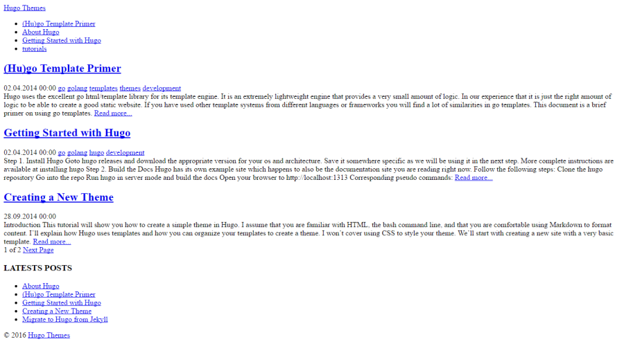 Just look at how blank this theme by Vimux is
By starting with such a blank theme, there isn’t much I would have to remove before it truly is the void of a starting point I deserved.
To use the theme, I created a new Hugo website by running hugo new site personal-website, then downloading that blank repository to the themes folder of my new site.
Step 2: make the blank theme even blanker
I found a number of things annoying in the blank theme:
- The home page automatically had previews of the blog posts. I wanted my homepage just to have my photo and some text.
- On the index pages, such as the page that listed all the blog posts, it automatically pagenated it. So the user would only see the titles of 10 blog posts at a time before having to press “older.” I preferred to have all of the blog post titles on one page.
- Pages would have a “latest posts” sidebar that would show some recent blog posts. I found this to make the pages look busy.
All of these changes ended up being quick to fix within the blank theme I downloaded to my personal-website Hugo project. By editing the files in the themes/blank/layouts folder of my project I was able to remove all of these functionalities. Since there was very little content in these pages to begin with, it wasn’t hard to find the parts I wanted to remove.
Step 3: add the styling you want.
I personally love using bootstrap for my styling. I’ve been using bootstrap for years as a general framework to make my sites look good, from simple static webpages to interactive R Shiny demos running machine learning models. Bootstrap is extremely powerful and flexible and easy to learn!
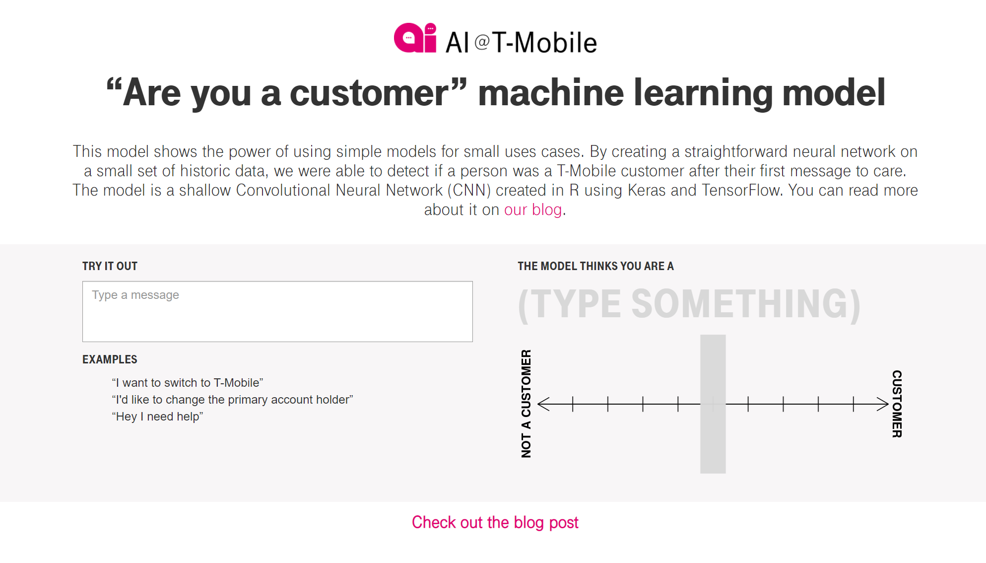 A Bootstrap website showing machine learning at T-Mobile
To get beautiful bootstrap you need to do two things. First, go make yourself a pretty bootstrap style by editing variables from the default bootstrap style. I find Bootstrap.build to be a delightfully fun website for editing Bootstrap styles, and I highly recommend it here.
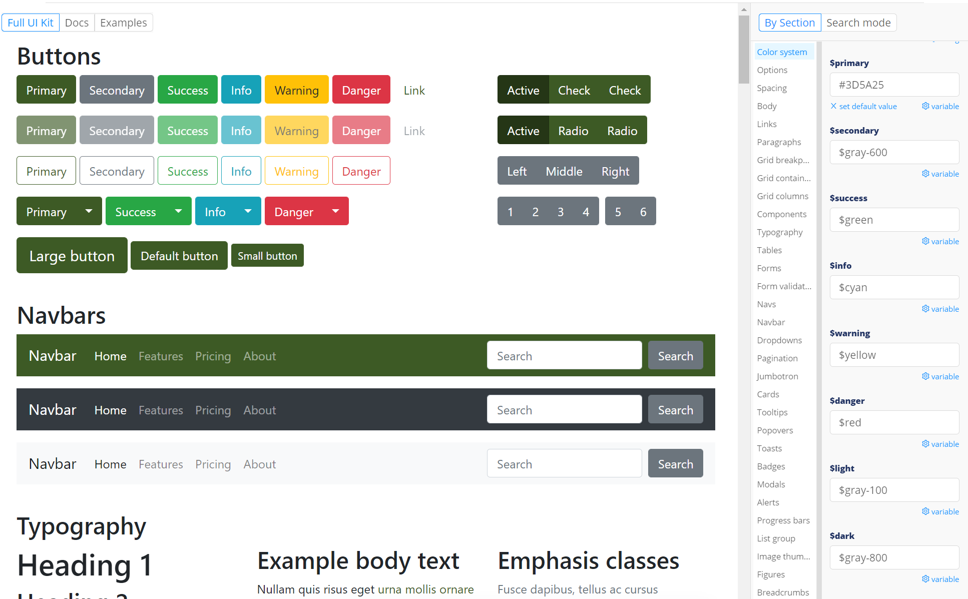 Look at how fun this looks.
When you’ve gotten it how you like it, export the files to the themes/blank/static/css/ folder of your Hugo project. Then make the following edits to the themes/blank/layouts/baseof.html file of your project, which is the file that has the HTML which will appear on every part of the website. First, edit the header to link to the bootstrap css you created:
<head>
    <!-- ...a bunch of existing stuff ... -->
	<link rel="stylesheet" href="/css/bootstrap.min.css">
</head>
Then edit the body of the same file so right at the end it’ll load the required JavaScript (Bootstrap and it’s jQuery dependency):
<body>
	<!-- ...a bunch of existing stuff ... -->
	<script src="https://code.jquery.com/jquery-3.5.1.slim.min.js" integrity="sha384-DfXdz2htPH0lsSSs5nCTpuj/zy4C+OGpamoFVy38MVBnE+IbbVYUew+OrCXaRkfj" crossorigin="anonymous"></script>
    <script src="https://cdn.jsdelivr.net/npm/bootstrap@4.6.0/dist/js/bootstrap.bundle.min.js" integrity="sha384-Piv4xVNRyMGpqkS2by6br4gNJ7DXjqk09RmUpJ8jgGtD7zP9yug3goQfGII0yAns" crossorigin="anonymous"></script>
</body>
Great! Now your website will have the Bootstrap framework available! You’re not done though, because you’ll probably want to add some more general content, like a navbar for the sites. Bootstrap again makes this easy. For instance with the navbar, you can edit the themes/blank/layouts/partials/header.html file to include a Bootstrap navbar.
I spent a few hours tweaking my site to have all the customizations I wanted. You may find yourself bouncing around a bit between files–for instance I was going back and forth on should my navbar menu choices be hard coded in that header.html file, or more programmatically included in the config.toml file. Ultimately I decided that I could do whatever I wanted because it’s my own theme and there are no rules, baby! A few of the things I fussed with included:
- The way dates are formatted on the list of blog posts
- How the open graph tags rendered subtitles of blog posts
- The size of the font to use in the titles of pages
- …and so much more!
Step 4: add the content you want
For me there were generally three different types of pages on my site:
- General info pages like the: about me, podcast, and art page, which I wanted to be fairly customized.
- Blog posts
- The index page for the blog posts
All of these ended up being fairly easy to generate as markdown. At times when I wanted some custom formatting: for example on my art page I both wanted a fancy button to take people to my Etsy page, and also a plugin that would render my Instagram photos on my own website. I used raw HTML in my markdown to do this! Note to get raw HTML to work in your markdown files you need to add the following to the config.toml file for your website:
[markup.goldmark.renderer]
unsafe= true
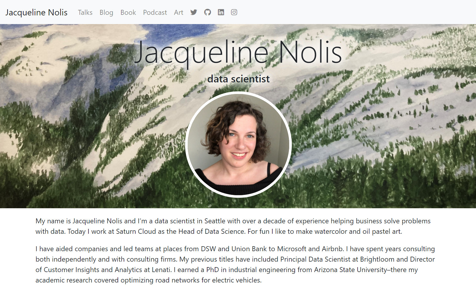
Here is what my home page looked like after I added content and customized it. I’m really happy with how it turned out!
Bonus step: rename it–it’s yours!
As a very last fun step to using Hugo with my custom theme I renamed the theme from blank to jackie. I made it available on my GitHub too, but if you take anything away from this blog post it should be that you shouldn’t use my theme and instead should make your own!
-
It might sound like being fussy is bad, but I love it. It’s so much fun to spend half an hour picking out just the right shade of green for a button, or getting the aspect ratio right on the image that shows up when you share a link to the page on Twitter. To me, fussing is the art of paying extra attention to detail for no particular reason except to make yourself happy. ↩︎