Guessing the year you were born from baby names using R
A simple question shows the pains of data science
Recently an article has been going around Twitter on the rise and fall of the name “Heather." Heather was an immensely popular baby name during the 1970’s and 80’s, but the name quickly tapered off into obscurity. JD Long, a well-known data scientist working in the insurance industry, made this tweet about it:
One of those "what age are you without using numbers" answers (at least in the US) is that I am "Chad, Clay, Jennifer, and Lori" years old... https://t.co/Zq4RwUAYPH
— JD Long (@CMastication) September 21, 2018
Reading the tweet, and the response by data scientist Jennifer Thompson, made me wonder what at the time I thought was a simple question:
What set of four baby names best indicates the year you were born in?
In JD’s case, he believes that the four baby names for his birth year are Chad, Clay, Jennifer, and Lori. For me, born in the mid 80’s, I would guess the four names of my birth year are Matthew, Michael, Laura, and Elizabeth. But what actually are the best names to pick, and how can we show it with data?
This kind of question is exactly what data scientists deal with all the time. When you read it, it sounds like a very precise question you can quickly answer. Once you start thinking about it, it turns out to be very tricky to understand. Soon you realize that just how you approach the problem can dramatically alter the answer, and there is no one right approach to it. I ended up taking three different attempts at attacking the problem, with some interesting and distinct results.
Attempt 1: Using the names that are most statistically likely to come from the year.
To me, the term “best indicates” means that when if you were to tell someone those four names, they know the exact year you were born in. That definition inspires my first way of turning it into a statistical problem: What is the set of four names that if they were drawn randomly from a year are most likely to have been drawn from that year in question?
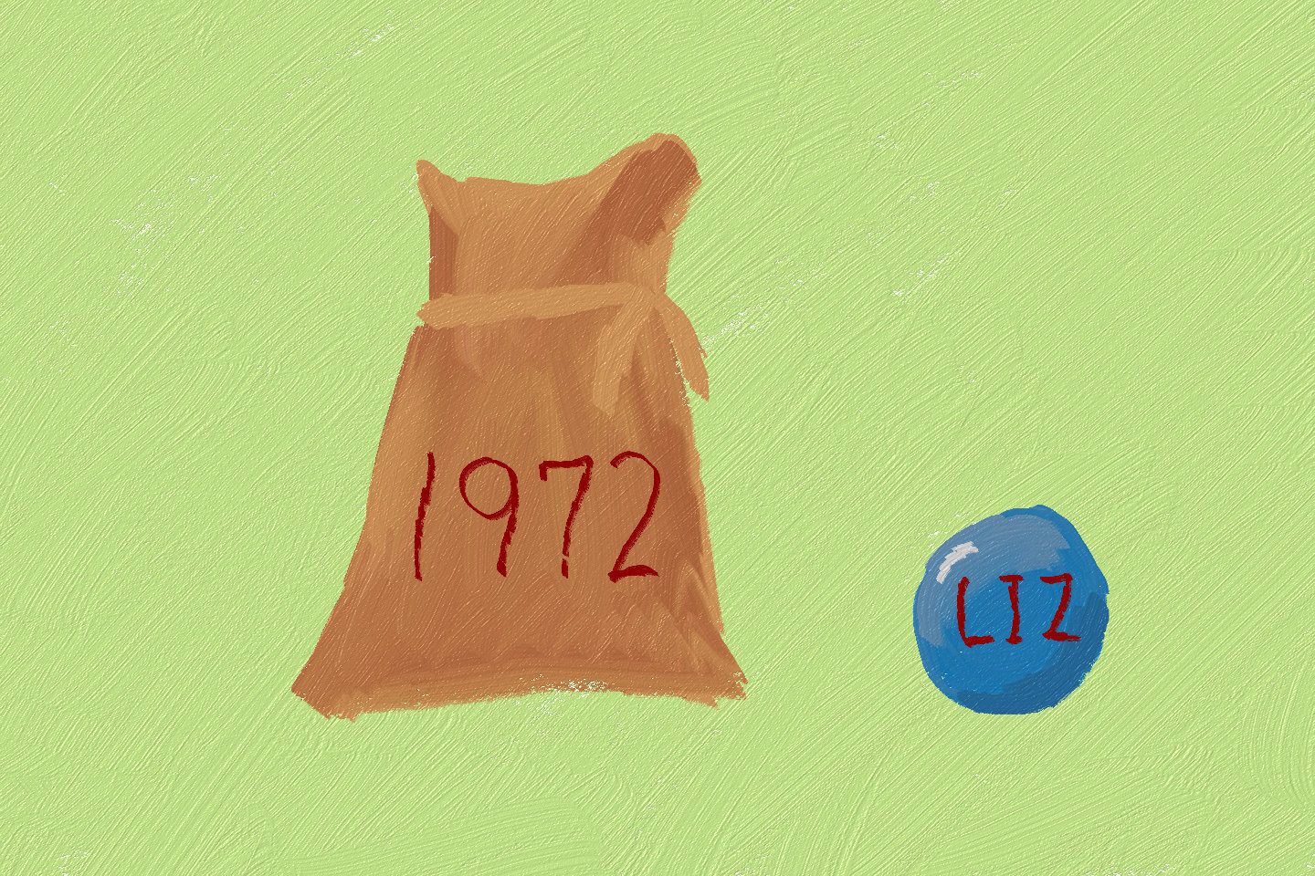
To put it another way, suppose I had a bunch of burlap sacks and each sack had a year written on it. In each sack I had marbles with names written on them for each person born that year. If I looked inside the bag and chose four marbles then handed them to you, what would be the four I should choose that would make you guess the year?
 This is a super weird metaphor but like, aren’t most statistical and combinatorial framings?
With a little bit of mathematics starting with Bayes theorem, it turns out that we want to find the four names that maximize: P(name|year)/P(name). Or take the probability of pulling the name in the year we care about, and divide it by the probability of pulling the name across all years (I assume the years are equally likely).
Let’s do this in R! Thankfully, Hadley Wickham made a package for easy baby name analysis using government data. Unfortunately this is using US data only, and there is no way the results extrapolate to other countries. First, let’s load up the libraries we need:
library(babynames) # to get the baby name data
library(dplyr)
library(tidyr)
library(ggplot2)
The package babynames contains a dataset babynames with a row for each year, baby name, and the assigned gender at birth (which is incorrectly labeled “sex”). It has the number of times that name occurred, and the percent of babies born that year with that name and assigned gender. Only name and gender pairs that occurred at least five times in the year are included.
> babynames
# A tibble: 1,858,689 x 5
    year sex   name          n   prop
    <dbl> <chr> <chr>     <int>  <dbl>
    1  1880 F     Mary       7065 0.0724
    2  1880 F     Anna       2604 0.0267
    3  1880 F     Emma       2003 0.0205
    4  1880 F     Elizabeth  1939 0.0199
First, let’s calculate the total probabilities to use as the numerator in that fraction for each name. The code below creates a data frame with a row for each assigned gender and name pair:
    total_props <-
      babynames %>%
      complete(year,nesting(sex,name),fill=list(n=0,prop=0)) %>%
      group_by(sex,name) %>%
      summarize(total_prop = mean(prop)) %>%
      ungroup()
The code takes the table babynames, fills in the missing rows with 0’s, the takes the average probability for each name and assigned gender pair.
Then, we compute the probability of each name and assigned gender within the year, and join it to the previous table. We compute the ratio, and look at the top four per year:
most_informative_ratio <-
    babynames %>%
    inner_join(total_props,by=c("sex","name")) %>%
    mutate(value = prop/total_prop) %>%
    group_by(year) %>%
    filter(row_number(desc(value)) <= 4) %>%
    ungroup() %>%
    arrange(year,desc(value))
Let’s look at the results! Here are the most informative names for 1980:
> most_informative_ratio %>% filter(year == 1980)
# A tibble: 4 x 7
    year sex   name           n       prop   total_prop value
    <dbl> <chr> <chr>      <int>      <dbl>        <dbl> <dbl>
1  1980 F     Nykeba        26 0.0000146  0.000000107    136
2  1980 F     Sumeka        14 0.00000786 0.0000000578   136
3  1980 F     Renorda       11 0.00000618 0.0000000454   136
4  1980 F     Shanndolyn    11 0.00000618 0.0000000454   136
What the heck are these names!? Renorda? Shanndolyn? It turns out that these four names only showed up in the data in 1980. So these names are extremely obscure, and very rarely used. So if I said the four names that indicate the birthday of 1980 are “Nykeba, Sumeka, Renorda, and Shanndolyn” then yes, those names were only used in 1980 and thus I indicated the year. However, implicit in the question was the assumption that the person I am talking to has heard the names before. My statistical formulation of the question failed to account for something that was never said but really necessary. So if we want to take into account that the person who you are talking to has to have heard of the names, we need a new approach
Attempt 2: Using names that are the most above their average to indicate a year.
The issue with attempt one is it didn’t take the popularity of the name into account, only the informative power of the name. The idea of using the average popularity of the name and the popularity within the year seemed like it still had promise, so what if we changed it to the difference between the two numbers?
This gives formulation two: What set of four names names have the highest increase in their usage from their average in a given year? So if averaged across years male Michaels are 1% likely, if in a particular year male Michaels are 5% of children then we would give that a value of 4%? What names have the highest value?
So again using the total probability table from before, lets compute a new most informative table. Now the value is the difference between the probability for that year and the total one.
most_informative_diff <-
    babynames %>%
    inner_join(total_props,by=c("sex","name")) %>%
    mutate(value = prop - total_prop) %>%
    group_by(year) %>%
    filter(row_number(desc(value)) <= 4) %>%
    ungroup() %>%
    arrange(year,desc(value))
And let’s view the table for 1980:
> most_informative_diff %>% filter(year == 1980)
# A tibble: 4 x 7
    year sex   name            n   prop total_prop  value
    <dbl> <chr> <chr>       <int>  <dbl>      <dbl>  <dbl>
1  1980 F     Jennifer    58381 0.0328    0.00609 0.0267
2  1980 M     Jason       48173 0.0260    0.00413 0.0218
3  1980 M     Michael     68673 0.0370    0.0178  0.0192
4  1980 M     Christopher 49088 0.0265    0.00785 0.0186
Great! These look like popular names from 1980! And if you look at the different years the names seemed aligned to the popular ones from that time. Unfortunately, now the years tend to blend together. Let’s look at the four names between 1978 and 1982. Here I add the rank of the name within the year, and a name_gender variable I create to make a table. I use the tidyr spread function so we can see all this data at once
most_informative_diff %>%
    group_by(year) %>%
    mutate(rank = paste0("rank_",row_number())) %>%
    ungroup() %>%
    mutate(name_gender = paste0(name,"-",sex)) %>%
    select(year,rank,name_gender) %>%
    spread(rank,name_gender) %>%
    filter(year >= 1978, year <= 1982)
The results are:
# A tibble: 5 x 5
    year rank_1     rank_2        rank_3        rank_4
    <dbl> <chr>      <chr>         <chr>         <chr>
1  1978 Jennifer-F Jason-M       Michael-M     Christopher-M
2  1979 Jennifer-F Jason-M       Christopher-M Michael-M
3  1980 Jennifer-F Jason-M       Michael-M     Christopher-M
4  1981 Jennifer-F Jessica-F     Michael-M     Christopher-M
5  1982 Jennifer-F Christopher-M Jessica-F     Michael-M
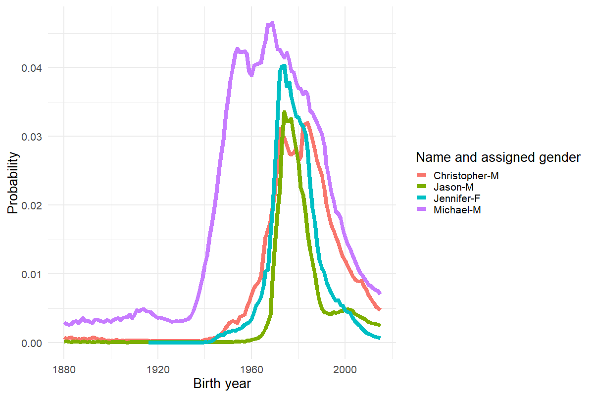
If you look, the only difference in the names between the five years is that Jason is replaced by Jessica in 1981. That’s not great for our objective of using names to guess the year. Here is a plot of the probabilities of the four names from 1980. You can see that while they all do peak around that time, there is a fair number of other years where they are high:
most_informative_diff %>%
    filter(year == 1980) %>%
    semi_join(babynames, ., by = c("name","sex")) %>%
    mutate(name_gender = paste0(name,"-",sex)) %>%
    ggplot(aes(x=year,y=prop,group=name_gender, color = name_gender))+
    geom_line(size=3) +
    theme_minimal(20)+
    labs(x="Birth year",y="Probability",color = "Name and assigned gender")
Attempt 3: Fuck it let’s just make a cool interactive visualization to wow people.
While I could have spent ten more hours trying to precisely come up with the best statistical framing of the problem, I wanted to try something different. If the goal is to convey some meaning from data, often it’s better to make something interesting that causes the person to think more deeply about it. And sometimes you just have business executives that like playing with things. Whatever your situation, interactive visualizations are great.
I decided to use the R package shiny to create a random sample classroom. This is a great way to see what the names of the people around you would be like if you were born in a certain year. It conveys the popular names, plus what the unpopular ones are like. **Try it for yourself!** If you want to play with the very short code, it’s available on GitHub.
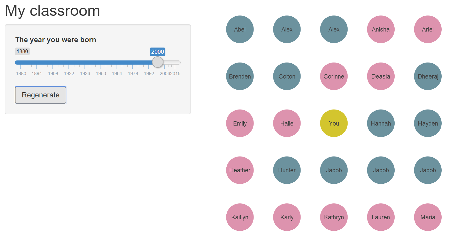 The my-classroom tool showing a class from the year 2000. You can tell the year by the three Jacobs and two Alex-es(?). Click the picture to try it for yourself!
This small project was a great reminder for me that simple questions may not be easy to solve with data science. Even if you have all the data you could ever need in one single table, coming up with a way of turning the question into an analysis can be a show stopper. While this was a fun mini-project, the same thing can happen with business questions like “which customers have the highest retention?” or “how many products have we produced this quarter?” In these instances the best thing you can do for yourself and the people you are working with is immediately tackle the framing of the question and get buy in before spending a ton of time just making interactive visualizations.